When did you last get lost in a mall, a parking lot or even your own city? Finding the optimal way is literally what “wayfinding” stands for. But as maps and plans get more complex, visual cues become key to guide people around space. If done properly though, it’s much more that just an arrow on the wall. It’s time to go beyond signage and start designing experiences!
Everyone is familiar with the ‘you are here’ dot, but what comes after? In this inspirational blog we will show you some examples of wayfinding systems that do more than just higlighting a route. They really connect people with the environment so that everyone can enjoy the best possible experience.
1. Amsterdam Airport Schiphol

Photo Credits: Mijksenaar
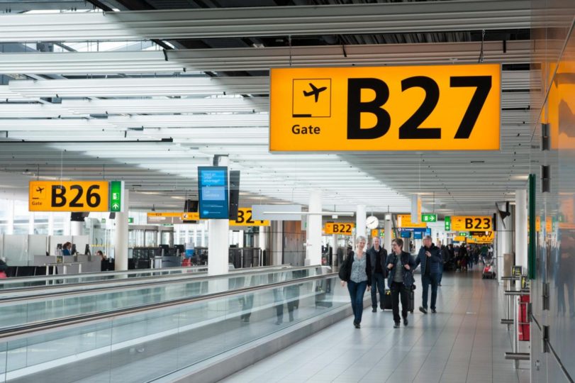
Amsterdam Schiphol is one of the world’s biggest airports. Thousands people cross it every day rushing from one gate to the other. This can easily make it a very confusing and stressful place to be. To guarantee the best travel experience, Mijksenaar designed the innovative user-friendly wayfinding system for Schiphol since 1990. The secret? Less signs and better flows!
Schiphol has set a new standard worldwide. The system pays homage to simplicity. Without losing a sense of aesthetics, wayfinding goes back to basics. Avoiding the typical overload of confusing signs, big clear letters guide people through space. To create easy-to-follow layouts, bold pictograms and bright colors are combined. In its simplicity, this solution really gives a sense of well-being, safety and security. The final result is really rush-proof! At Schiphol passengers don’t have to think about directions nor getting lost: all they have to do is enjoying a relaxed journey.
2. Cambridge Innovation Center

Photo Credits: Pim Top
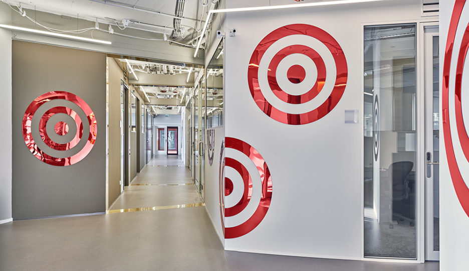
Wayfinding is not only about bringing people from A to B. It should also serve to inspire and create a sense of place! That’s what ‘Work’ from Rotganzen does in Rotterdam’s Cambridge Innovation Center. The project, realised in collaboration with Arttenders, adds humor and art to wayfinding.
CIC is a co-working space is where entrepreneurs meet, work and socialize. Of course though they don’t have to get lost in the building. The challenge was to combine wayfinding and interior design, creating signage that is inspiring yet functional. Indeed Rotganzen’s colourful mirrors are both! Traditional landmarks became extraordinary artworks in the shape of pizzas, clouds and champagne bottles.
The signs highlight the interconnections between spaces creating easy mental maps. With such an iconic design, people immediately recognise where they are. The mirrors don’t only give directions though. They also give entrepreneurs a time to self-reflect! Whether one is looking for a direction in life or in the office, just follow the pizza.
3. Phoenix Children’s Hospital

Photo Credits: HKS Architects
Getting lost between clinical hospital corridors is not really the kind of experience one looks for. Thus, to welcome and guide its patients and visitors around the space, the Phoenix Children’s Hospital developed an innovative solution. The challenge was to combine functionality and professionalism in an inspiring and comforting atmosphere. Indeed, the cheerful wayfinding system designed by HKS Architecture manages to do it!
Color functions as a marker within the whole complex. Through different lights and shades, pathways are defined in a clear and playful way. From floors to ceilings, the space becomes totally immersive! In this way by integrating the signage system in the overall design, it becomes more visible, making the final result even more efficient. With its unique personality, here wayfinding helps to find the way but also to escape reality!
4. Here East

Photo Credits: dn&co
Here East is London’s home for making, where tech and creative minds come together. Even if it’s home to some of the sharpest entrepreneurs, transforming a 1.2 million-square-foot building into an intuitive space is indeed challenging.
Inspired by electronic diagrams, dn&co has created a unique wayfinding system. The solution combines both digital and physical elements, going from outside to the inside of the tech hub. To make the language expressive but also representative, the design employs the typical symbols of electronic drawings. The large bright orange signs in fact are connected by multiple lines, giving shape to a giant floor graphic that further guides through space. Once inside the complex, people really step into a circuit diagram. And for those curios to know what each symbol means, explanatory postcards at the reception are available too. In this way everyone can enjoy the wayfinding experience to its fullest!
5. Visa Euorope Collab

Photo Credits: Fabrik
Wayfinding engages people while they interact with space. However, its design can be much more. As a part of companies’ identity, visuals help to connect brands and people. For this reason, wayfinding signs need to have a personality too!
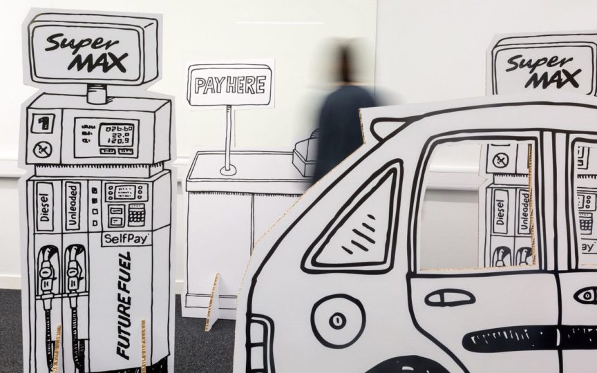
In occasion of the Visa Design Jam at City University London, Fabrik designed a town of 3D props grasping the quirky DNA of Visa Europe Collab. In ‘Cardlessville’ everything reflected the purpose of the event. Challenged to develop future methods of payment, students were physically immersed into the creative process! Life size shops, warehouses and petrol stations in fact encouraged participants to enact real world shopping scenarios. Combining the entrepreneurial and slick facets of Visa’s innovation hub, wayfinding became fun and inspiring. And whilst guiding people, it also created a strong sense of place among participants!
6. Jewel Changi Airport Discovery

Photo Credits: Carve
In today’s experience-driven world, people don’t want just to get to destination. They want to be amazed during the journey! In search of a way to offer a memorable place its travellers, Jewel Changi Airport opened Canopy Park. This multifunctional complex is a green oasis in front of Terminal 1. Among its palms and plants Carve designed ‘Discovery Slides’, a shiny jewel for adventurous travellers.
A work of art, a playground and a panoramic spot, the slides attract passengers of all ages. During endless layovers, they really create the ultimate airport and wayfinding experience! In addition to the unique panorama, this play point is also a shiny landmark. By helping people to determine where they are, it guides everyone to the right destination. Moreover it also offer a complete overview on the terminal. In this way travellers can have fun whilst they understand the environment. The bright and polished surfaces literally reflect our sense of place! This landmark is a sensational solution that radically reimagines both wayfinding and the passenger journey.
These projects prove that wayfinding isn’t just about signalling the quickest and fastest way. By creating a sensational experience, it really connects people and places! Thinking about wayfinding as a multidimensional process can make its design functional, unique, and fun at the same time. Arttenders can create unique experiences for brands and spaces, do not hesitate to contact us.
